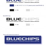
Our client has been using the old logo in the last 10 years. Due to their plan of moving forward not only the new location but also the next era. So we were called to discussed about their new branding design.
At first we knew this German own company very little. It was not easy just to come up with the branding design. Therefore we went to interview the executive to get some information of the changes. The company is designing and producing electronic products such as chips boards, circuits and touch screens etc. They ship out their made to order products to all over the world but mainly in European countries. We had a feeling that the logo must be modern, clean but yet international to represent the sophisticated and technical information in a very simple way.
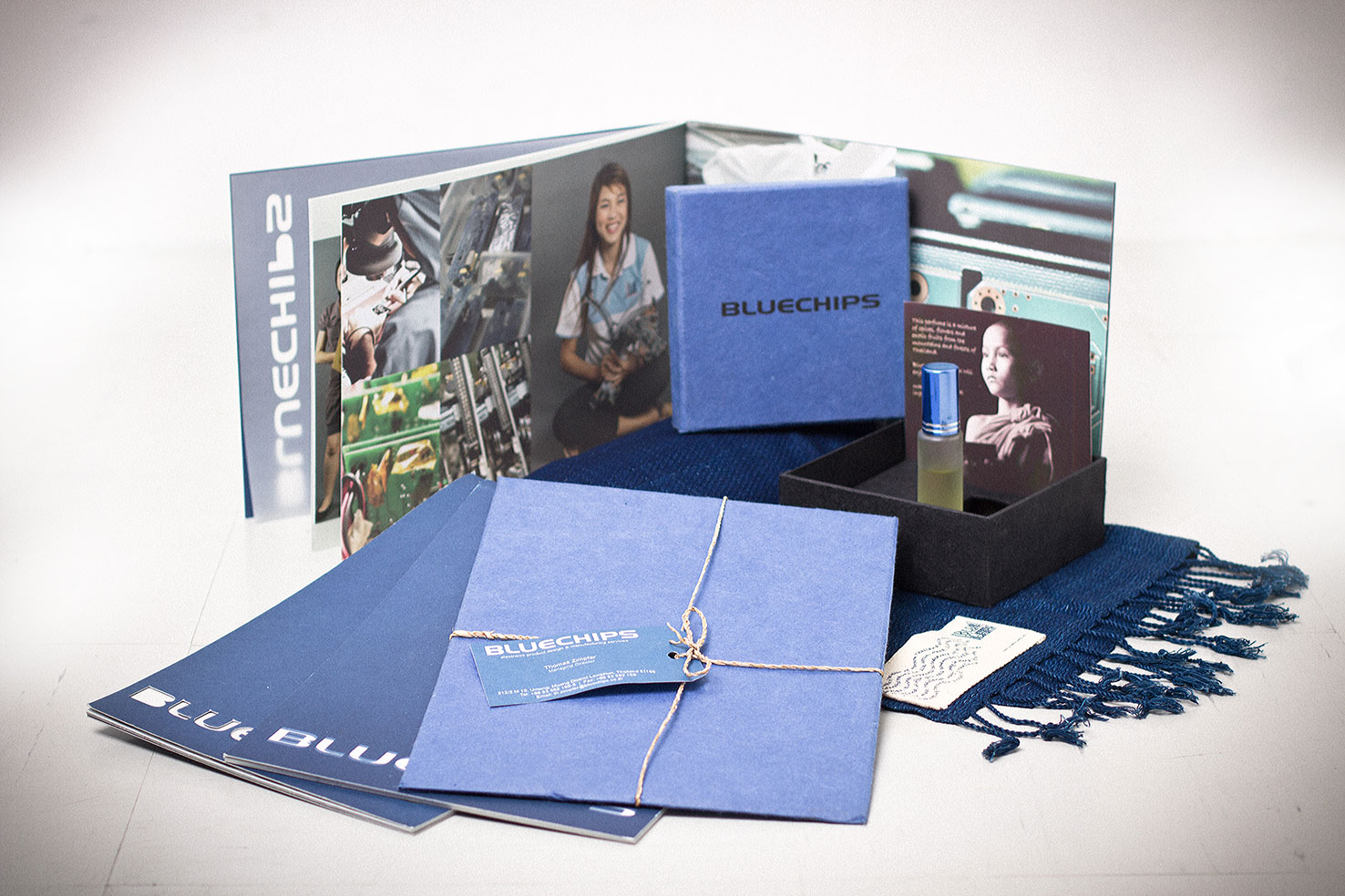
As a result of that bold font, solid color and a hint of simplicity were used for this branding design concept. Moreover the owner has asked us to include the employee recognition and Chiang Mai city, where the new factory will move to, in the Graphics package as well. We though may be the executives and staff images should be combined with some graphic effects as the key element. Consequently we took many photos in the factory to sort out what we can use. As well as taken the staff out of their work place and had much of fun taking photos around town with them. Finally, we finished this branding design project before time that they moved their factory. In conclusion we made a company branding guideline in a booklet for the management to use for their PR.
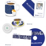
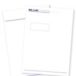
Below are some examples of the work we did for Bluechips Microhouse. They include mug designs, CD designs, order sheets, name cards, company logo, envelopes, posters for exhibitions and some other printing materials. The company now is in San Kam Pang, Chiang Mai.
